많이 사용되는 Flutter 기본 위젯들
1. Scaffold: provided a basic structure for a screen, including a top app bar, a body, and a bottom navigation bar.
2. Container : contain other widgets and can be styled with properties like padding, margin and color.
3. Text: display text on the screen and can be styled with properties like font size, font weight and color
4. Row: used to lay out widgets in a horizontal arrangement. (행)
5. Column: used to lay out widget in a vertical arrangement. (열)
1. Scaffold
that provides a visual structure for a screen, including a top app bar, a bottom navigation bar, and a body.
It is often used as the top-level widget for a screen in a Flutter app(최상위 위젯)
Here are some of the key features and properties of the Scaffold widget(속성들)
- appBar: This property is used to specify the widget that should be displayed at the top of the screen as the app bar. It can be a simple AppBar widget or a custom widget that you define.
- body: This property is used to specify the main content of the screen. It can be any widget or combination of widgets, such as a ListView, a Column, or a Container.
- floatingActionButton: This property is used to specify a button that floats above the body widget and is typically used to trigger a primary action on the screen, such as adding a new item to a list.
- bottomNavigationBar: This property is used to specify a widget that should be displayed at the bottom of the screen as a navigation bar. It is typically used to provide navigation between different screens or sections of an app.
- drawer: This property is used to specify a widget that should be displayed as a side drawer on the screen. It is typically used to provide access to additional app functionality or settings.(햄버거 메뉴)
아래는 코드 예제이다.
import 'package:flutter/material.dart';
void main() {
runApp(MyApp());
}
class MyApp extends StatelessWidget {
@override
Widget build(BuildContext context) {
return MaterialApp(
title: 'Scaffold Example',
home: Scaffold(
appBar: AppBar(
title: Text('Scaffold Example'),
actions: [
IconButton(
icon: Icon(Icons.search),
onPressed: () {},
),
IconButton(
icon: Icon(Icons.more_vert),
onPressed: () {},
),
],
),
body: Container(
color: Colors.grey[300],
child: Center(
child: Text(
'This is the main content area',
style: TextStyle(fontSize: 24),
),
),
),
floatingActionButton: FloatingActionButton(
child: Icon(Icons.add),
onPressed: () {},
),
bottomNavigationBar: BottomNavigationBar(
items: [
BottomNavigationBarItem(
icon: Icon(Icons.home),
label: 'Home',
),
BottomNavigationBarItem(
icon: Icon(Icons.favorite),
label: 'Favorites',
),
BottomNavigationBarItem(
icon: Icon(Icons.person),
label: 'Profile',
),
],
currentIndex: 0,
selectedItemColor: Colors.blue,
onTap: (index) {},
),
drawer: Drawer(
child: ListView(
padding: EdgeInsets.zero,
children: [
DrawerHeader(
decoration: BoxDecoration(
color: Colors.blue,
),
child: Text(
'Drawer Header',
style: TextStyle(
color: Colors.white,
fontSize: 24,
),
),
),
ListTile(
leading: Icon(Icons.settings),
title: Text('Settings'),
onTap: () {},
),
ListTile(
leading: Icon(Icons.help),
title: Text('Help'),
onTap: () {},
),
],
),
),
),
);
}
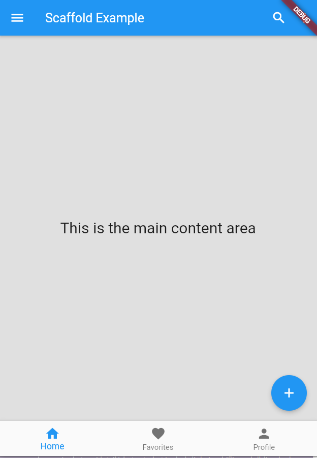
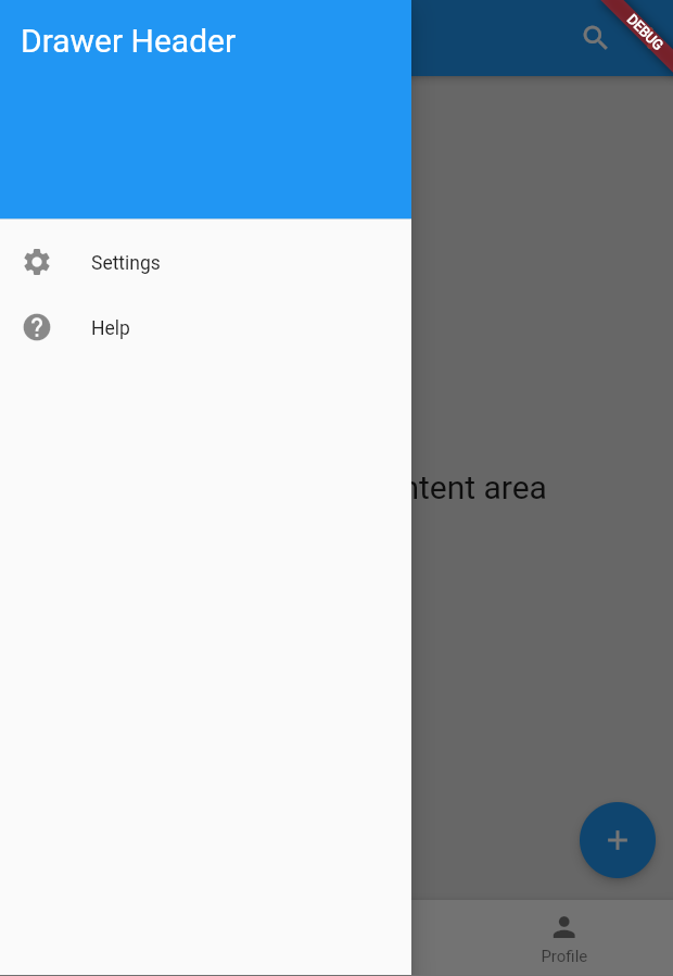
}In this example, we create a more complex Scaffold widget with various additional features:
- The appBar property has two IconButton widgets added to its actions property, which display icons for searching and more options.
- The body property is set to a Container widget with a grey background color and a centered text message.
- The floatingActionButton property is set to a FloatingActionButton widget with a plus icon and an onPressed method.
- The bottomNavigationBar property is set to a BottomNavigationBar widget with three items, each with an icon and a label, and a selected item color.
- The drawer property is set to a Drawer widget with a header and two ListTile widgets for settings and help.
'개발일지 > Flutter' 카테고리의 다른 글
| appBar에서 PreferredSizeWidget 오류 발생시. (0) | 2023.06.05 |
|---|---|
| Error: unable to find git in your PATH. (0) | 2023.04.28 |
| Flutter -Visual Studio CODE - develop for Windows (the doctor check crashed) ERROR (0) | 2023.04.19 |


